Prep work and design
This site was designed and developed by me to showcase my skills and previous work. I was inspired by one page websites to make something truly beautiful. I decided on three pages, a landing page, a page that showed my projects, and a resume page. I wanted the landing page to have a strong impact focusing on me, so first I took a variety of pictures to put in the center.
I decided it should be relaxing and elegant, so I chose a color scheme of green and white. Green is traditionally the color of grown and renewal, while white indicates completion and openness. I choose a darker green to contrast with the white, and chose pictures with more greenery in them.
Coding and Adjustments
After trying to work with my old wordpress eportfolio, I was quickly frustrated by the lack of control wordpress allowed me, so I attempted to register a domain with google sites only to grow frustrated with google site's lack of customization options.
Fortunately I had a github account which comes with one free domain, so I quickly converted that from an old project to a new portfolio site. I quickly began to write my site, only to discover that unfortunately the photos I took did not play nice with different monitor aspect ratios. I was forced to abandon my one page design and write a more traditional three page design.
The Landing Page
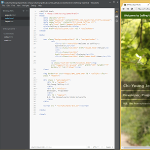
A navigation bar was added to the top, for convenience, with fixed positioning for better browser integration. The element sizes are also based on viewport height to better accomodate various monitor sizes. The nav bar was originally going to link to a seperate page for all of the projects I have done, but that would result in a ridculous amount of links. I considered bunching them up into a list, but decided to simply choose a few projects that best displayed the current me, and focus on those.
I overlayed some introductory text over the picture so the viewer would know who I was. Black background with white text so it would be easily readable, and some transparency so as to not break up the background picture. I chose the photo with the best lighting and centering. The pictures taken were much too big so I resized the one chosen to about half, then I added a fade in animation to smooth the loading time transition. I added a simple blinking animation to draw attention to the resume link.
The Projects Page
At around this time, I realized that a resume page would be redundant with a projects page, so I added a download link to the landing page instead and removed the resume page. The first iteration of the projects page was much simpler with an ugly repeating tan background. I tried to build descriptions of the projects into the page, but count that it just increased the page clutter and made the page visually appealling. I removed the background and raised the images to make them pop out more.
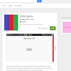
I decided to focus on the eportfolio and built a seperate sidebar to house the other three projects. I accompanied the pictures with external links to fill them out content-wise, and then built up another main container to full explain my Eportfolio design decisions.
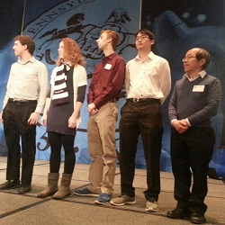
Humanoid Robot Nao Skit
Student-programmed robot steals the show at president’s tailgate:
Link to article